
Nobody shows you the before.
These three start there: what was wrong, what I changed, and what it does now. The last part is easy to write. The first is the one that tells you whether somebody actually looked.
The projects
Mana Wellness & Aesthetics
A site nobody at the practice could log into, so nothing could be fixed, so the errors compounded until they were the kind that matter for a clinic.
What was wrong
The old site was not badly designed so much as unowned. Nobody at the practice could log into it, so nothing could be fixed, and because nothing could be fixed the errors compounded into the kind that matter for a clinical practice: a nurse’s card carrying a doctor’s credentials, a stock face under a clinician’s name, a ZIP code from a town forty miles away, hours that turned an open Friday into a closed one, and three booking buttons that split whatever intent a visitor arrived with. The stale event banner and the CONFIRM placeholders were the tell. Not one mistake, but a site left running unattended long enough to drift. Underneath all of it, the treatments were listed the way the industry names them, by device and by injectable, so a client arriving with a goal had to know the vocabulary to find the right page.
What I changed
The first job was getting the practice control of its own site back, because nothing else holds if the next correction has to wait on someone who has left. Then I reorganized the whole catalog into five treatment pillars named for outcomes rather than procedures, so someone can start from what they want to change and reach the relevant treatments from there. Booking was restructured to lead with a consultation, which matches how the practice actually takes on new clients, and the three competing buttons became one. I rebuilt the provider profiles against the real credentials, corrected the details the old site had drifted on, built the site bilingual because a significant share of the practice’s clients are more comfortable in Spanish, and structured it to carry more than one location.
What it does now
The site presents five clear entry points instead of an undifferentiated treatment list, serves both languages from the same structure, and makes the consultation the primary action on every page. The practice can now correct anything on it the same day it is noticed, which is the part that keeps the rest true.
Serenity Peak
An unfinished WordPress template whose gaps ran from cosmetic to legal, on a site a psychiatric practice was asking patients to trust.
What was wrong
A clinical practice has a duty of care that extends to its website, and the previous one was a WordPress template that had never been finished. The gaps ran from cosmetic to legal. Its footer linked to a privacy policy, a HIPAA notice and terms, and all three pointed at a dead anchor, because none of them had been written. Two unedited template counters advertised “4.9 Customers Reviews” and “20+K Visits completed” for a practice with six. The editor’s own “Hero Section” label printed as body text on two pages, the About page ran its closing paragraph above its introduction, and the practice’s name appeared three different ways. Underneath that it was invisible to search and slow with it: no meta description on any page, no heading at all on four of six, no structured data, over 5MB and more than a hundred requests a page, and empty alt text on all twenty-two images on the home page, the provider’s own portrait included. The private-pay position, which is the first question every prospective patient asks, was nowhere near the front.
What I changed
I rebuilt it rather than patching it, because a template that was never finished has no floor to build up from. The service architecture makes each offering explain itself and state what it costs, the private-pay position is in plain sight rather than behind an enquiry form, and an interactive intake assessment lets someone work out whether the practice is a fit before they call. The build is mobile-first and to ADA standards: semantic structure, headings in order, alt text throughout, visible keyboard focus, contrast checked against WCAG AA, and no motion a visitor has not asked for. Nothing ships with a placeholder still in it.
What it does now
The practice has a site that answers the cost question honestly and early, lets someone self-assess before committing to a call, and meets the accessibility bar a clinical practice is held to.
Eats by Snorlax
A personal project with three unrelated jobs to do at once, and one home page between them.
What was wrong
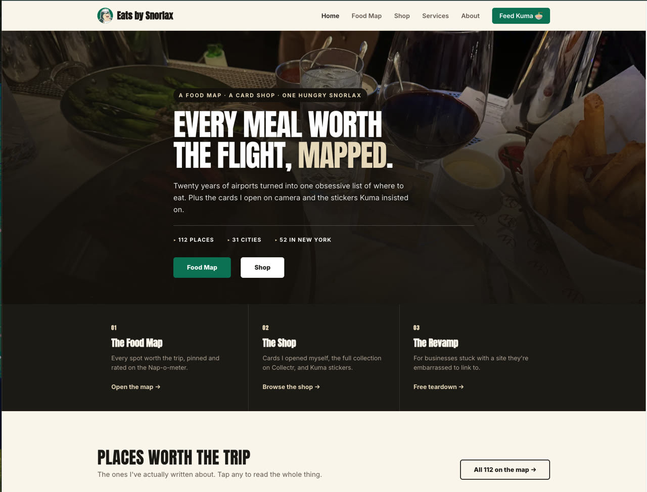
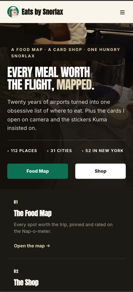
A personal project with three unrelated jobs to do at once: a restaurant map built over twenty years of travel, a shop for trading cards, and a pitch for website work. Three audiences arriving for three reasons, with one home page between them.
What I changed
I gave each job its own numbered entry on the home page rather than merging them, so a visitor sorts themselves in the first screen instead of being sold all three at once. The map carries its own scale in the header, which is the thing that makes it worth opening.
What it does now
Three separate reasons to be on the site, each one move from the top, and none of them competing with the other two.
The next step
Your practice could be next
If any of this sounds like the site you have, or the one you do not have yet, start with the free teardown.
eric@thepracticepixel.com